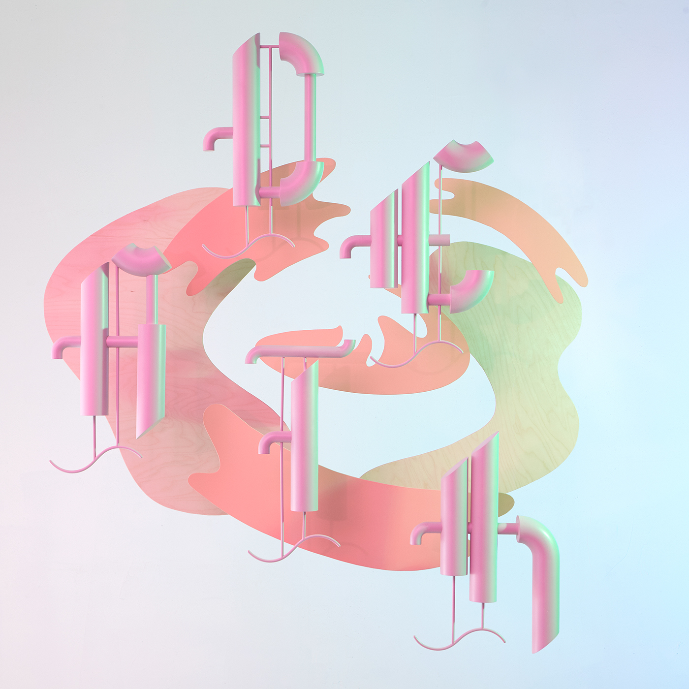
“Death” started as a personal exploration in letter form. I wanted to reinterpret a blackletter typeface as a real tangible object. The goal was to not only create a flat silhouette with a simple extrusion but to use the three dimensionality of space as an integral part of the letter. By using tubular shapes for strokes I was able to give the shapes depth and form, the large strokes enveloping the smaller ones and the thin strokes recessing towards the inner parts of the letters.
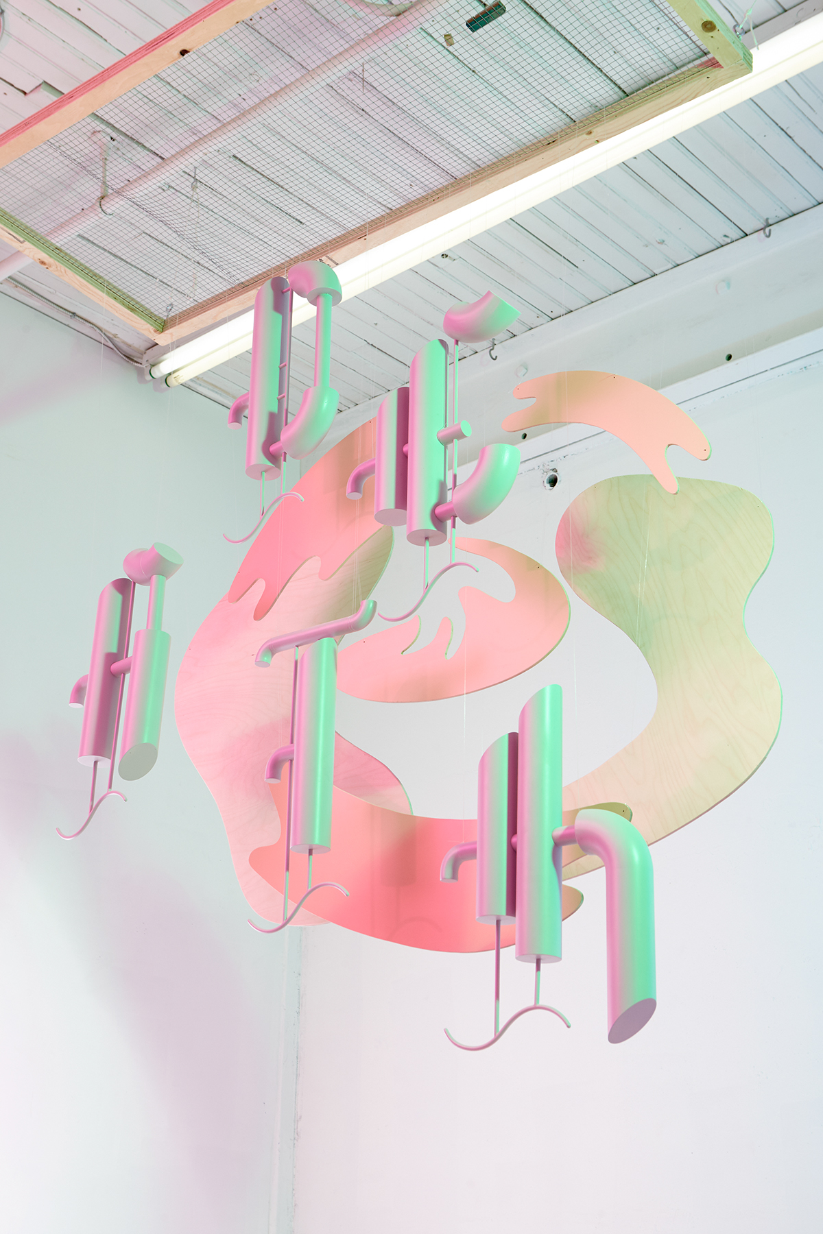
Facetiously I decided that “death” was the only appropriate word for this typeface, but as I played with it the humour dissipated and I started feeling a certain beauty in the statement and in the forms. Not in the macabre but in the myth, the afterlife. I decided to display the word floating like a spirit, with a swirl taking the viewer inwards. Using coloured gels we were able to photograph the project with pastel coloured lighting to give the whole thing a somewhat ethereal feeling.


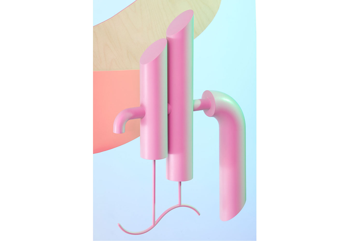

The letters were made by hand from a variety of plastics: acrylic, abs, and pla. The back panels jigsawed from wood, and everything meticulously hung from a wire grid. As the parts were handmade no 3d software were used to create the images and only minimal amounts of photoshop were necessary.

Design and construction: Frédéric Bouin
Photography: Nathan Lang


